
Why Kitchen Colour Is One of the Most Impactful Decisions You Will Make
Colour sets the mood of a kitchen before anything else. The same layout with the same units can feel completely different in deep navy versus warm cream. Getting the colour right — and getting it to work with your light, your worktops and your flooring — is one of the most powerful ways to personalise a kitchen without changing its structure. At KBE Kitchens, we help homeowners across Arlesey, Stotfold, Bedfordshire and the surrounding area choose colour palettes that look great on day one and continue to feel right for years.
Start With the Light in the Room
The same colour looks entirely different depending on how much natural light the room receives and which direction it faces. North-facing kitchens receive cooler, bluer light — grey tones can feel cold and unwelcoming in these rooms. South-facing kitchens are more forgiving, allowing deeper, bolder colours to work without closing the space in. Before committing to a colour, paint a large sample swatch and live with it for a few days, checking it in morning light, under artificial light in the evening, and on an overcast day. Browse our kitchen ranges to see how colours look across different door styles.
Warm Neutrals: Safe but Not Boring
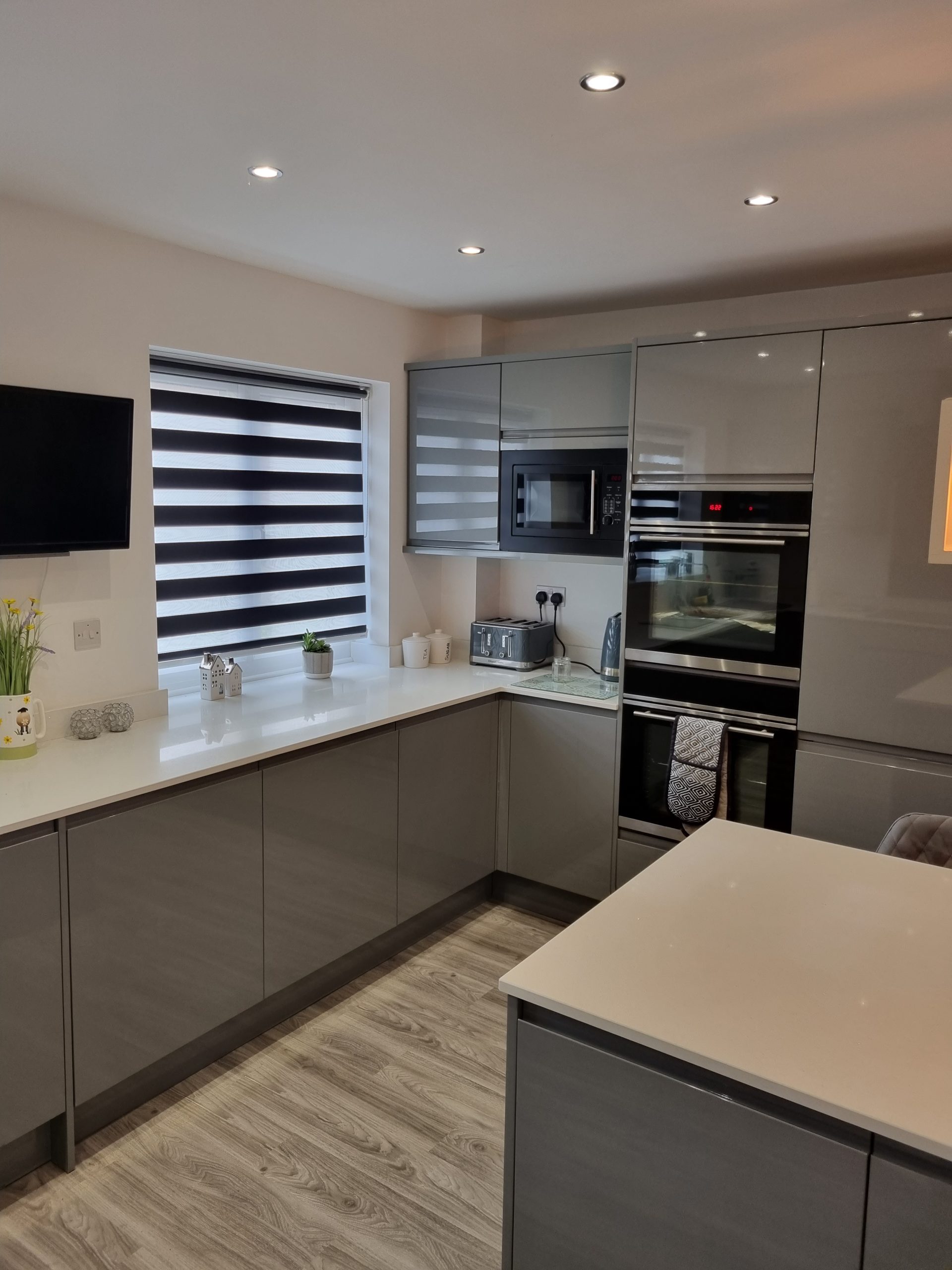
White, cream and warm off-white remain the most popular kitchen colours in Bedfordshire for good reason — they reflect light, make smaller kitchens feel larger and pair with almost any worktop and flooring combination. But not all neutrals are the same. A cool blue-white can feel clinical. A warm off-white with a hint of yellow creates a softer, more welcoming atmosphere. Greige — a blend of grey and beige — has become a popular contemporary option that avoids both the coldness of grey and the datedness that some beige tones carry.
Bold Colours: How to Make Them Work Long-Term
Deep greens, navy blues and charcoal greys have become mainstream kitchen colours across Arlesey, Stotfold and the wider Bedfordshire area. The key to making bold colours work for the long term is balance. A fully dark kitchen can feel oppressive in a smaller room. Dark base units paired with lighter wall cabinets, or a two-tone approach with a different colour on the island, creates depth and visual interest without committing the entire room to a bold colour that might feel dated in five years.
Worktops, Splashbacks and Flooring
Cabinet colour is only part of the picture. The worktop, splashback and flooring need to work with it, not fight it. A general rule: if the cabinets are bold, keep the worktop neutral. If the cabinets are neutral, the worktop and splashback are the opportunity to add character. Veined quartz, textured tile splashbacks and timber worktop sections all bring visual interest without dominating. Our design service includes material and colour coordination as standard.
Handles and Hardware
Handles are a small detail with outsized visual impact. Brushed brass and antique bronze suit warmer, more traditional palettes. Matt black works well with contemporary dark and light combinations. Polished chrome is versatile. Handleless kitchens remove the variable entirely and let the cabinet colour carry the visual weight.
Ready to Choose Your Kitchen Colours?
If you are planning a new kitchen in Arlesey, Stotfold, Bedfordshire or the surrounding area, KBE Kitchens can help you choose colours and finishes that work together and last. Browse our completed projects gallery or get in touch for a free design consultation.